
I have a number of multi select and single select filters in a custom portal and I’m attempting to change the default styling (background color, text color, spacing, etc.). Is there a way I can use CSS to do this?
The dev team could chime in with a more comprehensive list, but here are the custom formatting components that we have found so far to customize the multi-select and single-select filters:
Multi-select classes
.multiselect-container → outer container (background)
.p-multiselect-toggle__selection → header label
.p-multiselect-toggle__selection-list → selected values next to header
Single-select classes
.p-select-filter-toggle__collapse → outer container (background and label)
.p-select-filter-toggle__expanded → header background when list expanded
1 Like
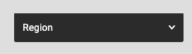
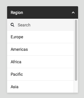
Here’s a standard Select Filter block in Custom Portal:
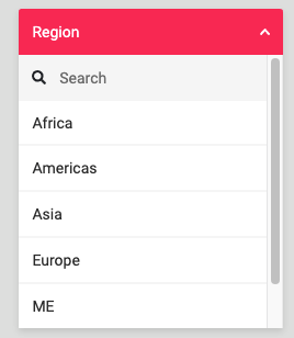
Here’s the same Select Filter block in Custom Portal with some basic CSS styling:

Here’s the CSS applied to this specific block:
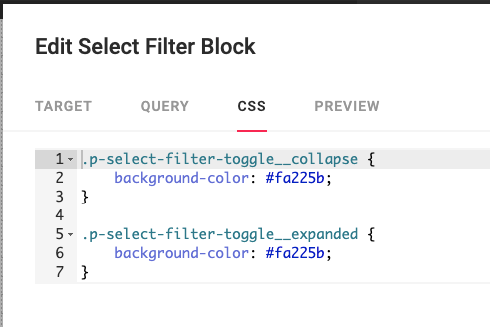
.p-select-filter-toggle__collapse {
    background-color: #fa225b;
}

.p-select-filter-toggle__expanded {
    background-color: #fa225b;
}
Note the rules for the collapse and expanded classes.
You could also use a variable from the theme:
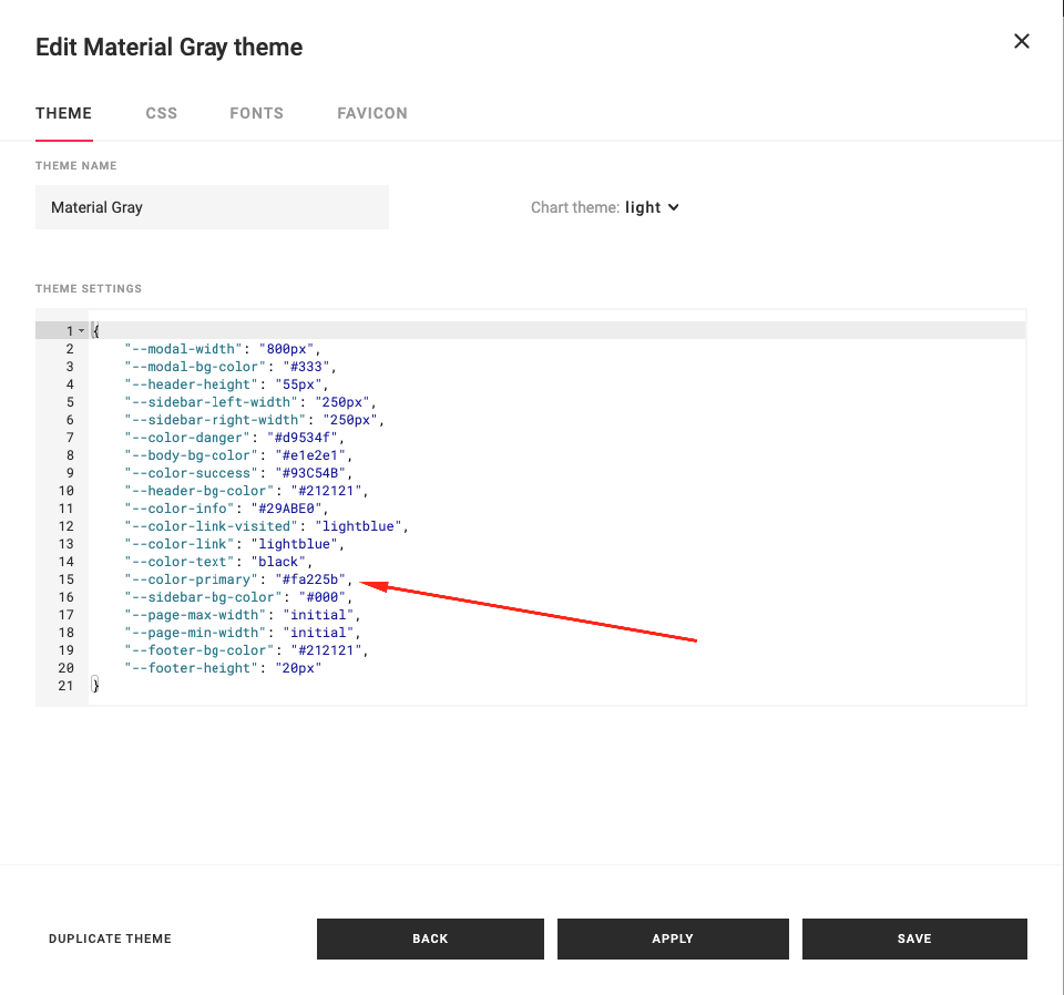
The Theme Settings on the selected Theme would include:
{
    ...
    "--color-primary": "#fa225b",
    ...
}
And the CSS on the block would include:
.p-select-filter-toggle__collapse {
    background-color: var(--color-primary);
}

.p-select-filter-toggle__expanded {
    background-color: var(--color-primary);
}